

Responsive Design for a Growing Coding Academy
Designing a responsive website for curriculum and cohort expansion
Foreword
Working in a cross-disciplinary team of developers and UX designers, this project was an opportunity to develop problem framing skills as a researcher while also refining communication skills as a developer conscious designer. As UX Lead I embraced more responsibility to provide the team with well-researched and validated problems while also being able to guide them with idea-provoking insights. Being involved at an early stage of the design thinking process, this project truly cemented my conviction that great design must build upon and be validated by robust research. The opportunity to exercise this symbiotic relationship between research and design for my team has allowed me to question my design practice going forward and equally inspires me to learn more about various research methodologies to improve and support future projects.
Client
Level Up Works
Alan Kan (Founder)
Role
Lead UX Designer
Project Management
User Research
UI UX Design
Prototype & Validation
Team
Jiajing Lu (UX)
Gaurang Ambani (Dev)
Benedict Velasco (Dev)
Duration
2 weeks (June 2021)
The Context
Inspired to share his love for code and STEM to his daughter, Alan started Level up Works - an after school coding academy for children aged 7-12. In the third year of operation, Alan has a dream of growing his business - from one tutor, one subject and one class of 5 students to 3 subjects and 10 classes by the end of 2022.
The Challenge
A website redesign that automates the digital experience of discovering and enrolling a child in Level Up Works while improving parent engagement of student progress.
Why is it a Problem?
The current website and enrollment process:
Wastes time - Alan spends more time on repetitive admin than growing his business.
Wastes opportunity to address user needs - parents want to track student progress but don’t have a way to do this.
The Outcome
An online enrolment process that saves 83% from the original process time: from 30 mins to 5 mins of both staff and Parent’s time.
A parent portal that tracks student progress while utilizing social media for organic marketing.
How? The Chosen Process
Kickoff Meeting
Brainstorm tasks according to the double diamond approach;
Identify task responsibilities, dependencies and estimated durations;
Clarify UX priorities to Developers and vice versa;
Collate tasks into a Kanban Board backlog on Miro.

We decided to employ the Double Diamond Approach prioritizing early user research and later design iterations.


Discover & Define
Phase Objective: Understand Alan’s vision for the academy and identify hindrances for growth also considering student and parent’s point of view.
Research Methodologies: Qualitative user research - Stakeholder Interviews, Class Observation, Existing Site Audit, Empathy Maps, User Personas, Existing Customer Journey and Existing User Flow. Crucial insights consolidated via Problem Statements and User Stories.

Stakeholder Interviews & Class Observation
• For Alan, we asked questions about business operations, motivations, competitors and pain points.
• We were able to observe a live class and interview current students and their parents.
• For parents, we focused on questions about enrolling and maintaining their child in the course. With the parents, we also conducted a site audit of the existing website.
We utilised empathy maps to process the gathered information and identify common pain points and motivations to craft three user personas.


Key Insights
Correlating Pain Points
While students were satisfied with their classes, Alan’s issue with time overlapped with parent’s anxiety about bothering Alan for questions about the course and student’s progress. We decided to focus on Alan and Parents as our target users going forward.

Existing User Journey & User Flow
To identify the crucial touchpoints for overlapping pain points, we visualised the current user journey for “Enrolling and Maintaining a Child with the Level Up Works Programme”. We also studied the user flow of the current website to identify what was working and where there was opportunity for improvement.


Key Insights
Correlating user dissatisfaction and a broken enrollment link on the current website - opportunities for digital disruption.


Summary of Key Insights
Alan has a dream of expanding his class numbers and curriculum but felt limited on time and resources to grow his vision;
Parents and Alan revealed that the current marketing strategy is word of mouth and the enrollment process is entirely manual;
Parents struggled to be informed about their child's progress in the class and Alan didn't have a way to track or share this progress.
Problem Statements & User Stories
To synthesize the insights gathered, we created problem statements and users stories to take into the next phase of the projects. From seven problem statements and user stories, we were able to narrow down to two: one for parents and one for Alan.

The Opportunity
How might we automate the marketing and enrollment process for Level Up Works to save Alan time to grow his business while satisficing parent’s curiosity about their child’s progress?

Design & Delivery
Phase Objective: Explore and test digital solutions for solving key user stories.
Research Methodology: Proposed User Flow, Information Architecture, Crazy 8 Sketches, Red Dot Voting System followed by Usability Testing and Semi-Structured Interviews for three rounds on a total of six participants.
Version 01 - Lo Fi Wireframe
Website and Parent Portal for Desktop
• Simplify content from existing website.
• Additional functionality of online enrollment process and parent portal.


Usability Test & Key Insights
The value of flexible and anticipatory design - support big growth for the academy!
While the usability tasks were successfully completed with minor updates required, questions about additional functions were mentioned: whether more than one child could be enrolled by one parent and whether other subjects were being taught at the academy.
Takeaway 01: Design to cater an expanded cohort where one parents could enroll multiple children into the course.
Takeaway 02: Design to cater an expanded curriculum beyond coding.
Version 02 - Lo Fi Wireframe
Website for Desktop and Parent Portal for Mobile Device
• Cater for expanding curriculum.
• Cater for more than one child enrolled by one parent.


Usability Test & Key insights
Importance of responsive design - catering for difference behaviors on desktop versus mobile device.
While the usability test revealed that our design was now flexible for curriculum and cohort expansion, there were some improvements to me made to optimize design for desktop and mobile devices.
Takeaway 01: Desktop Behavior
Clicking over scrolling
Takeaway 01: Mobile Behavior
Scrolling over clicking
Larger icon sizes required
Version 03 - Lo Fi Wireframe
Website for Desktop and Parent Portal for Mobile Device
• Clickable elements on desktop landing page to guide users through information.
• Scrollable discovery of information on mobile device utilizing both vertical and horizontal scroll.


Usability Test & Key insights
Final round of testing confirmed the flexibility and responsiveness of the latest version for both the website and parent portal. Insights to take into the next prototype included a focus on design heuristics and accessibility features.
Proposed Solution

1. Responsive Website Redesign
“A simple website where I can find the information I need and enrol my child to Level Up Works online.”
- Potential Level Up Works Parent

2. Parent Portal & Passive Marketing
“An intuitive parent portal where I can track my child’s progress and share their work to my family, friends and community.”
- Enrolled Level Up Works Parent
3. Automated Processes & Database of Student Information
“Automated enrolling and organic marketing that saves me time to grow my business!”
- Ecstatic Founder of Level Up Works
Simplified
Website Content & Brand Redesign

Digitized
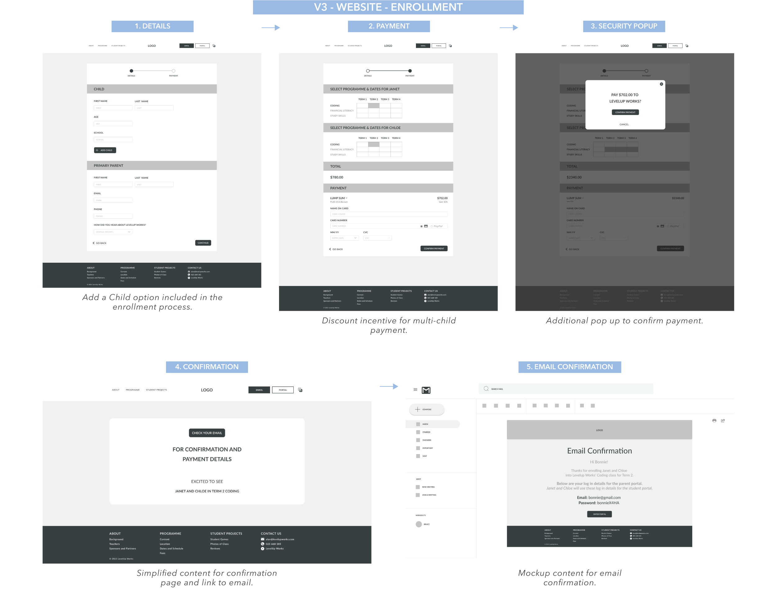
2 Step Enrollment Process


Anticipatory Design
for Expanding Curriculum and Cohort

Responsive Design
from Desktop to Mobile Device


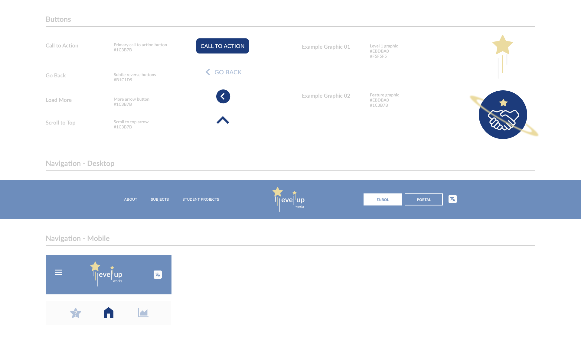
Design System
for Cohesive Design and Developer Handover

PROPOSED WEBSITE FOR DESKTOP & MOBILE
Video walkthrough exploring the Level Up Works website and enrolling two children into the course.
PARENT PORTAL FOR MOBILE
Video walkthrough sharing a student’s project on social media via the parent portal.
Reflections
From a design point of view, this project was a great exercise in designing for responsiveness - optimizing experience for both mobile and desktop. It was amazing to gain insight from usability testing to identify different user behaviors according to different devices used. Allowing these insights to influence our design going forward increased the usability of our proposed solution.
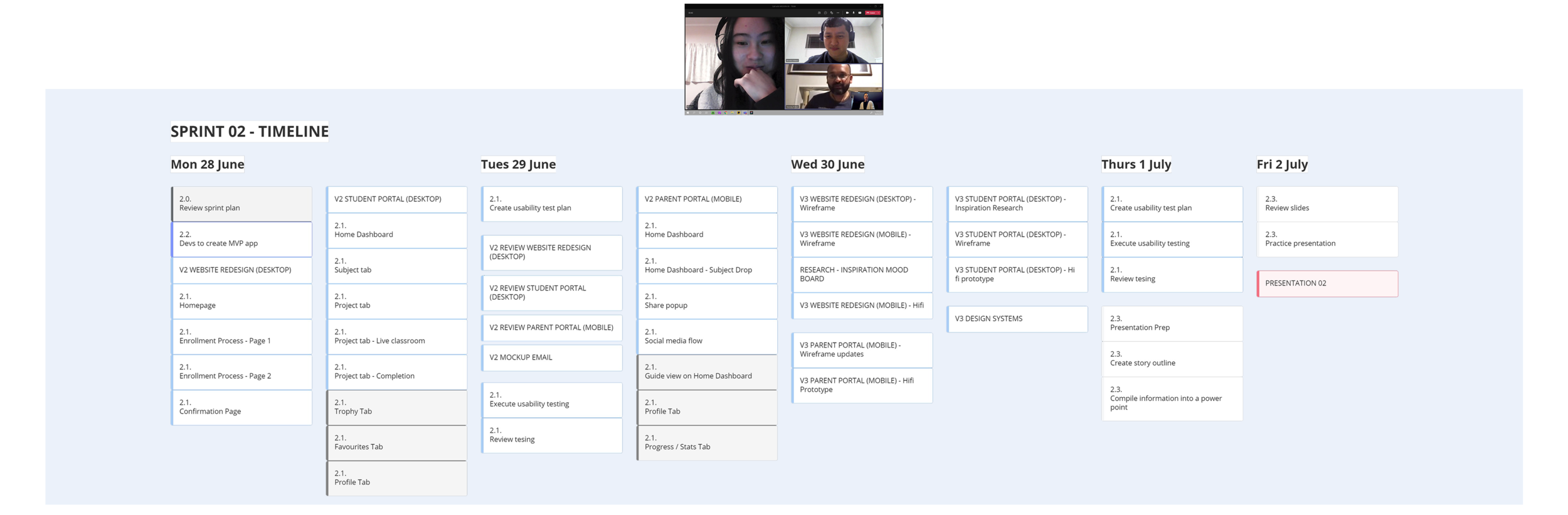
From a project coordination angle, working in a team of UX designers and developers was a productive exercise of collaboration. We were able to employ Agile thinking by utilizing Sprint Sessions, daily standups and a live Kanban board via Miro to manage the tasks of the project while meeting project deadlines. Collaborating with developers also encouraged the UX team to learn how to optimize a Figma file for a smoother developer handover including the creation of a design system.
Beyond additional iteration and usability testing, future steps for the project include expanding the digital eco-system to include a student and tutor portal in addition to the proposed website and parent portal.