

Digitizing the Insurance Purchasing Process
Designing an online experience to purchase Turners car insurance.
Foreword
Working in a team of strong-minded and intelligent UX designers from diverse career backgrounds was a fantastic opportunity to experience the power of collaborative UX Research and Design. As the saying goes: “two heads are better than one”! Throughout the project I found that there were certain insights I may have missed that were picked up by another team member and vice versa. In a team where each of us had opinions and strong design tastes, I quickly learnt the importance of communicating my ideas and backing these proposals with reason and rationale.
Client
Turners Automotive
Role
UX Designer
User Research
UI UX Design
Prototype & Validation
Team
Nathan Richards (UX)
Cypress Mark-Brown (UX)
Duration
4 weeks (May 2021)
The Context
Voted as New Zealand's most trusted used vehicle dealership, Turners Automotive are experts of buying and selling used cars. Less known about the company is that Turners also provides quality motor vehicle insurance.
The Challenge
A website redesign that digitizes the currently manual experience of purchasing car insurance through Turners.
Why is it a Problem?
The current insurance purchasing experience:
Is manual heavy - It currently takes an average of 10 minutes just to find the insurance page from the website home page and a longer time to call into the store and confirm documents let alone gather information about the insurance packages before purchase.
Frustrates users - Users currently rate the insurance purchasing experience an abysmal 2/10 due to long wait times and inability to purchase completely online.
The Outcome
1 min 30 secs to find the Insurance page to 3 secs average.
Failed to complete objective online to succeeding.
2/10 overall user experience satisfaction to 8/10.
The Process
We employed the 5-stage Design Thinking Model to establish groundwork research before design solutions were explored and to prioritize iterative prototyping and validation at later stages of the design process. A Trello Kanban board was created with user stories and task breakdowns. Daily standups were conducted to maintain and update the board as the project unfolded.


Research

Phase Objective: Dive into the experience and pain points of past insurance customers and current insurance specialist staff at Turners in order to clarify the reason for low awareness of Turners insurance services overall. Priority was placed on understanding problems with the current insurance purchasing process and empathizing with existing users before ideating, prototyping and validating possible solutions.
Research Methodologies: Qualitative user research - Stakeholder Interviews, Empathy Maps, User Personas, Existing Customer Journey and Existing User Flow.
Stakeholder Identification & Interviews
Following stakeholder identification, we clarified that Turners Insurance Staff and Turners Customers were the key influences to this project. Collaborating on Miro, the team prepared a list of questions targeting three main topics: User Motivation and Needs, User Pain Points and Future Design. We also prepared a usability test of the existing website for Turners customers in order to gauge the current metrics and user experience of the original design.
Empathy maps were formed from the answers gathered for both staff and customers. Focusing on customers as our main user groups, we explored three user personas within the 20-40 years old age demographic of typical Turners Customers mentioned in the interview with Turners Staff.


Key Insights
A Manual Heavy, Highly Unsatisfying Process
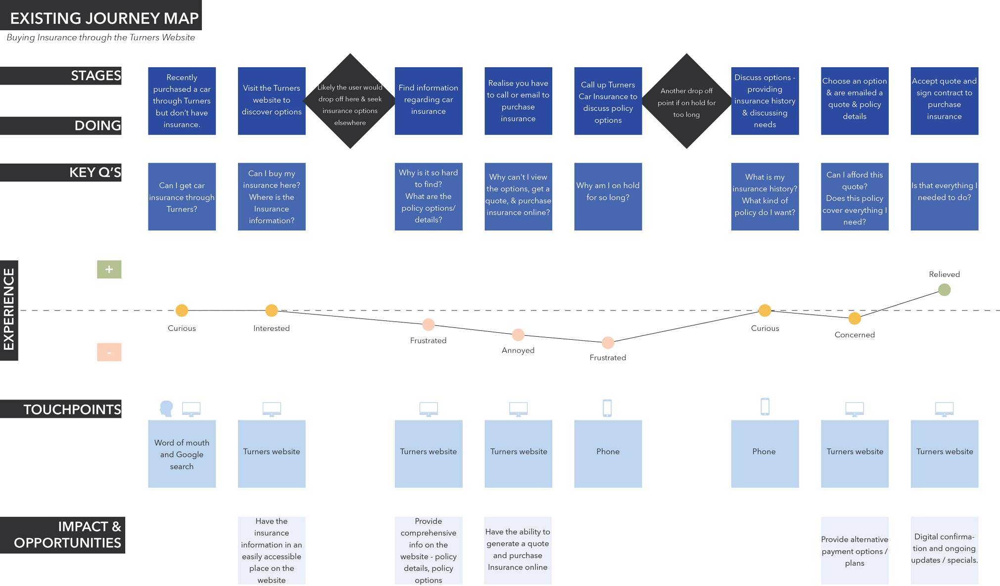
From the stakeholder interview and usability test alone, it was clear that the current process of purchasing insurance form Turners was manual heavy. Overall the experience of purchasing insurance online was rated at an average of 2/10, with users taking more than 1 minute to even find the insurance page while also failing to complete the task of getting a quote online.
Diving deeper into the pain points of customers, the existing user journey and user flow of the insurance purchasing process allowed us to identify the key stages in the process where drop off was likely and negative emotions were rife. The proposed user flow was developed and refined as we progressed through the design process but was helpful to place beside the existing user flow in order to see the focus of our improvements.

Key Insights
Two Stages Causing Great Frustration
Finding the insurance information page from the Turner’s home page proved to be difficult and is therefore the first potential point where drop off can occur.
The second point of extreme frustration occurs when a customer is faced with a barrage of text information on the insurance page. To find advice on the information requires either going into the store in person or calling for a quote.
Synthesize

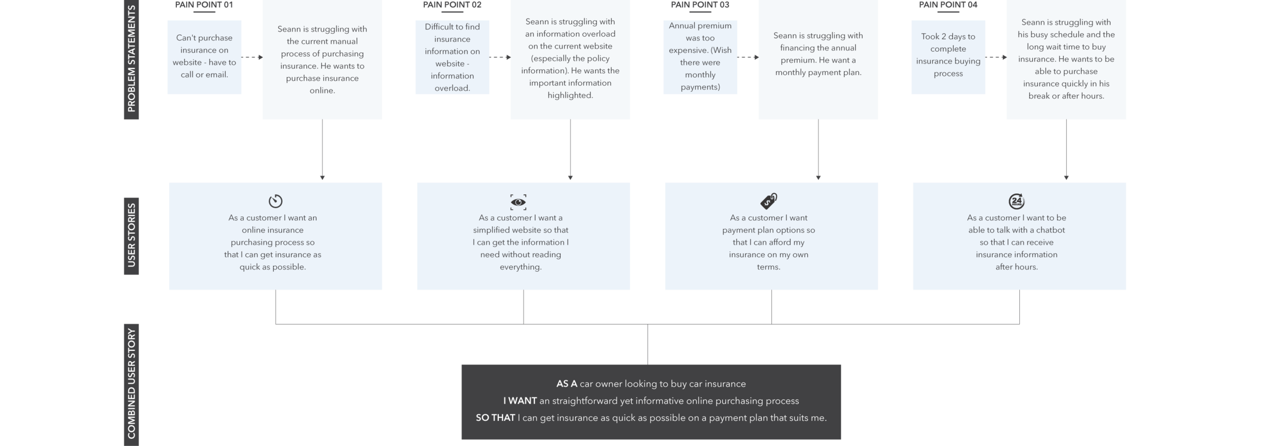
Phase Objective: Gathering our research insights, the team began to discuss the opportunities of the problem in front of us. From problem statements to user stories we were able to develop a single user story to address the issues that arose from our research. A user story is vital in Agile software development to capture a description of a software feature from an end-user perspective.
Research Methodologies: Problem Statements, User Stories.
Ideate

Phase Objective: Explore and test digital solutions for solving key user story.
Research Methodology: Affinity Mapping, Information Architecture, Crazy 8 Sketches, Site Audit of existing website to identify key opportunities to implement design heuristics.
To remind ourselves of the key pain points and improvement opportunities for the project, we conducted a collaborative affinity mapping exercise combining the insights gathered from early research stage.

Key Insights
• We were able to identify three key stages of the insurance buying process which we were then able to target with our proposed solutions.
Focusing on the re-design of the current Turners insurance page we formulated a proposed information architecture for collective guidance. The architecture content was based on information gathered via competitor analysis of other online insurance purchasing experiences as well as taking into account details from the original user flow.

Key Insights
• The insurance purchasing process can be simplified to four steps.
Crazy 8s was a productive method of rapidly generating ideas as a team. Through this exercise it was easy to pinpoint the hierarchy of content per page as well as identifying potential graphical exercises we would need to refine for certain information content including the comparison table and form pages. After sharing our ideas to each other, we utilized the red dot method (blue dots in our case) to identify which ideas to bring into our first wireframe.

Key Insights
• The policy comparison table proved to be a design challenge for the team as it was trying to communication three similar policies while also featuring a fourth ‘additional’ policy;
• The format of the forms could be kept consistent through the four step process as much as possible.
Before diving into our version 01 wireframe we also conducted a site audit on the original Turners Website. This exercise was productive as a collaborative activity as it allowed us to review the 10 Jakob Nielson Design Heuristics in the context of Turners and get us into the mindset of implementing these heuristics in our wireframes going forward.


Key Insights
• The current website has a distinctively bold branding that we wanted to honour going forward as there may be loyal customers who are used to the stylistic features of the website;
• There is opportunity to simplify the design for greater impact and better communication of key services and information.
Prototype & Validate

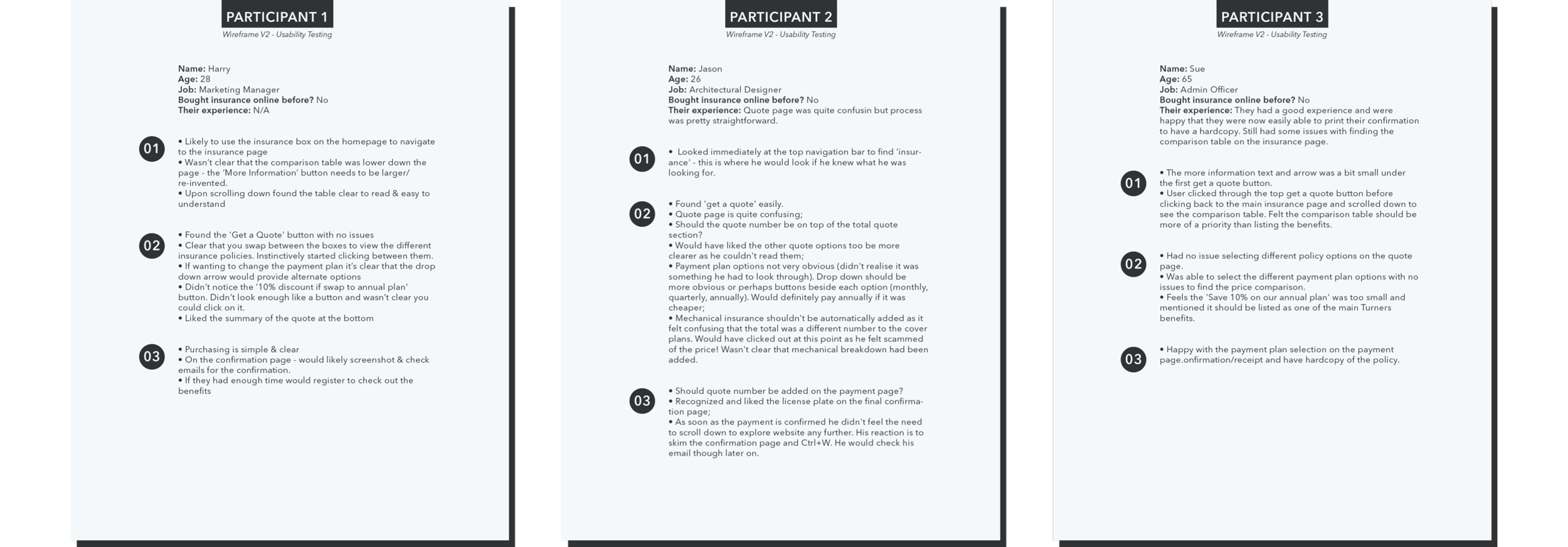
Phase Objective: Test, validate and iterate proposed solutions. Jumping into a collaborative Figma file, the team began to execute our sketches into pixels. After each version was complete we tested the solution and made adjustments accordingly. We conducted this process three times resulting in 3 iterated versions of a wireframe. The cycles of wireframing and validating were extremely beneficial to refine our final design proposal. From wireframe version 3 we began to execute the design system for the final prototype while taking into consideration the opportunities identified in our initial site audit.
Research Methodology: Lofi Wireframe, Hifi Wireframe, Usability Testing and Semi-Structured Interviews for three rounds on a total of six participants.
Wireframe Version 01
We created a Lofi Wireframe for the Home Page, Insurance Page, the four quote and purchasing pages and a confirmation page. Collaborating on a shared Figma file we took turns to edit the master file and discussed after each revision.


Wireframe Version 01 - Usability Testing Report
Key Insights
• Users required verbal cues to explore the page by scrolling down further. Adding a “More Information” button encourage this behavior was suggested.
• Users struggled to explore other insurance package options at checkout. Adding price options in a faded display on the Quote Page was suggested.
• The original resolution was set to a 15 inch mac book pro but we quickly found out that our users were using a range of screen resolutions. We decided to reformat the next versions to fit a 1920x1080 resolution desktop for a more universal application.
Wireframe Version 02
Taking into consideration the insights from the previous usability testing report, we revised the Wireframe into Version 02.


Wireframe Version 02 - Usability Testing
Key Insights - Readability and Aesthetic Features
• Users found that pricing option were too transparent to read. Increased opacity for the pricing options on the quote page noted for next version.
• Users did not scroll down the confirmation page to see the next call to action. Login options brought to the top of the confirmation page for a clearer call to action following purchase.
Wireframe Version 03
Taking our recommendations from our version 02 usability report we revised the wireframe once more. From here we brought the wireframe to a Hifi variation including the formation of a design system.
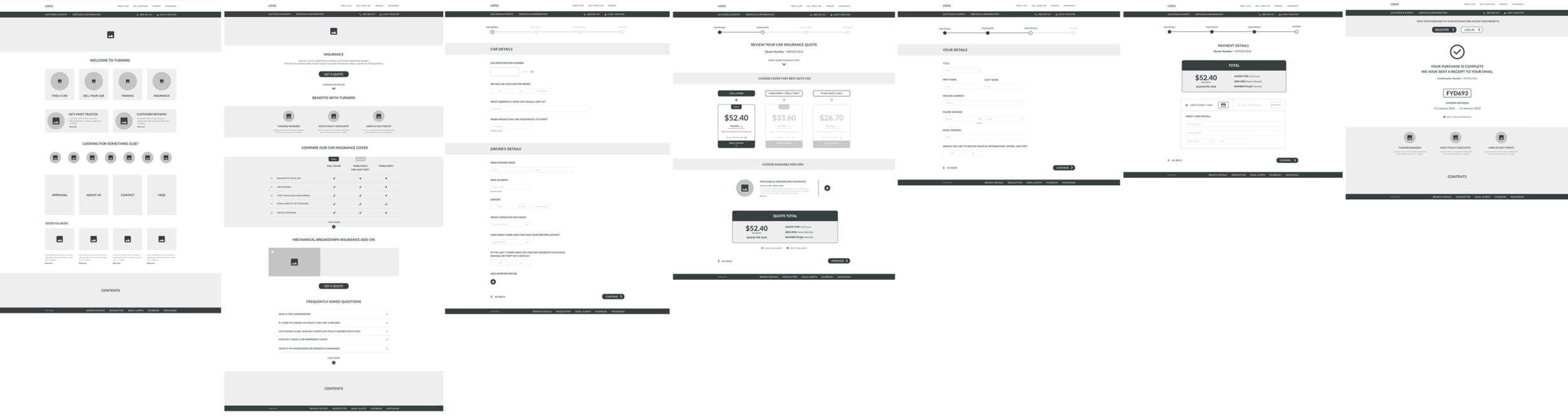
The Proposed Solution
Redesign of the existing Turner’s website to cater for generating a quote and purchasing insurance online in a simple and intuitive manner.

1. Home & Insurance Page Redesign
1 min 30 secs to find the Insurance page to 3 secs average.

2. Online Four Step Insurance Process
2/10 overall user experience satisfaction to 8/10.
Proposed Prototype
The following images present the proposed home page, insurance page, quote process pages and confirmation page. Notes about the design have also been added to explain the design decisions featured in this prototype according to developments from usability tests as well as internal UX audits according to usability heuristics


Proposed Design System
Simplifying the existing palette of colors, the proposed design system aimed to create a bold and punchy aesthetic without loosing reference to the distinct nature of the original Turners branding. Establishing a design system at the particle and atomic level was helpful in a team of multiple UX designers and developers as it provided consistency when variations were made as well as creating a material library for developers to reference.


DIGITISED INSURANCE PURCHASING PROCESS
Video walkthrough.
Reflection
This project was a great example of digitizing a previously manual process and how this can save time and solve human pain points. It opened my eyes to the manual processes in my own life that could be improved by automation or digital solutions.
Engaging the 5-stage Design Thinking model from beginning to end was a rewarding process. Taking the time to understand the problem by engaging users from the very beginning was a great way to center solutions to proven user needs. The more we conducted the cycle of prototyping and validating, we found that our solution became more and more refined with final usability metrics, such a user satisfaction and time taken to complete, supporting this improvement.